Recent Projects
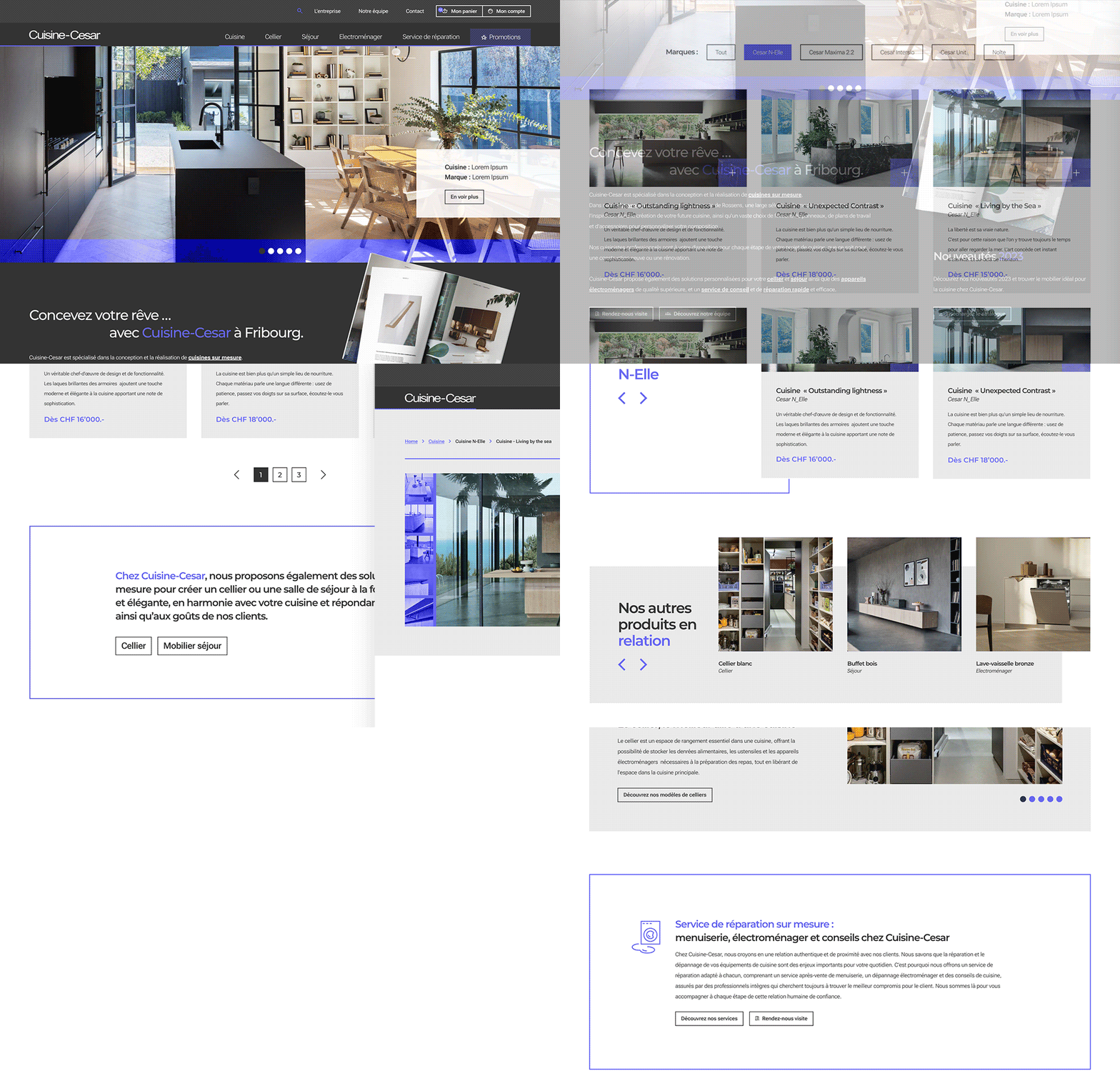
The key word for Cuisine Cesar was design. And it was easy to make this template design and fashionable, as the subject matter lent itself well to it. The product photography called for a bold, modern layout, as did the corporate identity, with its minimalist typography and colour scheme. This unstructured yet very balanced web design plays on off-camera elements, transparencies and contrasts. A real success.
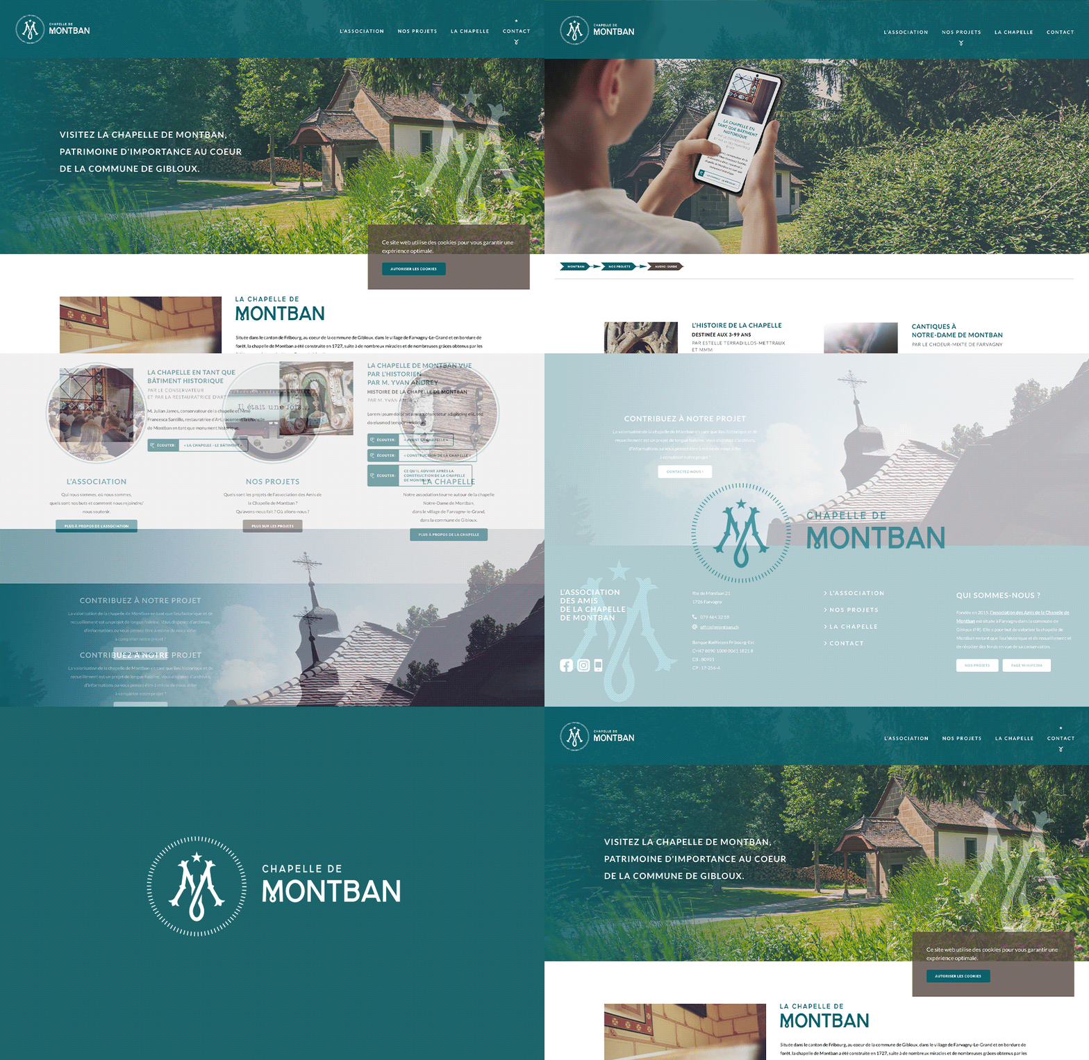
Situated in the canton of Fribourg, in the heart of the commune of Gibloux, in the village of Farvagny-Le-Grand and on the edge of the forest, the Montban chapel was built in 1727, following numerous miracles and graces obtained by the faithful who invoked “Notre Dame de Montban”. On the occasion of the magnificent renovation of the Montban chapel, I was asked to create a visual identity, a web design and various communications media designed to disseminate information about the renovation of this historic building to visitors, walkers, schools and believers. The client wanted to emphasise the historic building and its legend based on the apparition of the Virgin Mary.
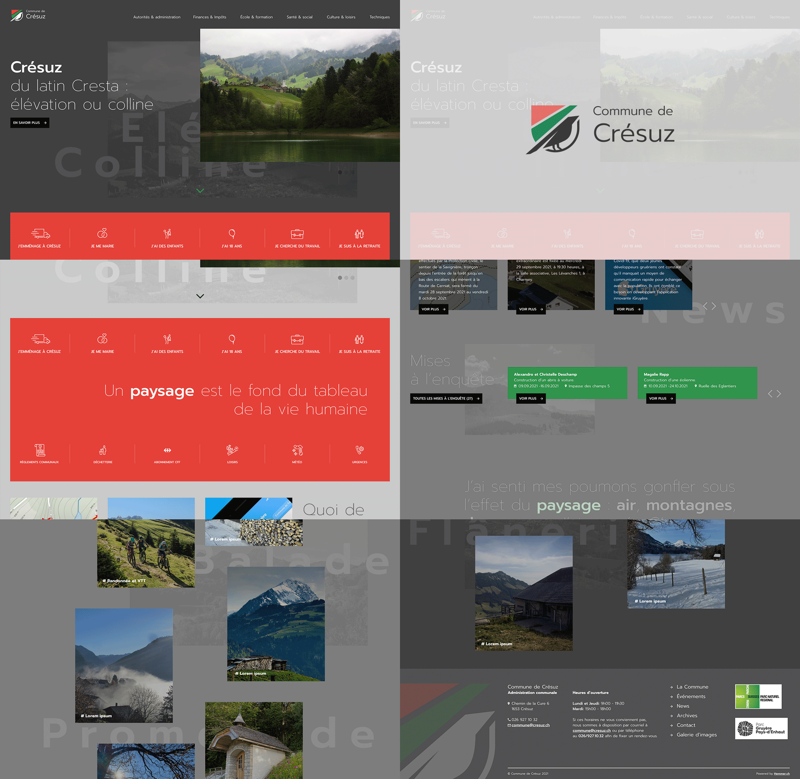
The Municipality of Crésuz being nestled in a rural and sylvan landscape on the edge of a lake, my idea was to focus my communication on the quality of life, the relationship between man and nature, and contemplation.
Small quotes punctuate the template and underline this intention.
And to accentuate the contrast and beauty of the places represented, the image gallery switches to darkened mode when scrolling, virtually alternating between sunset and sunrise.
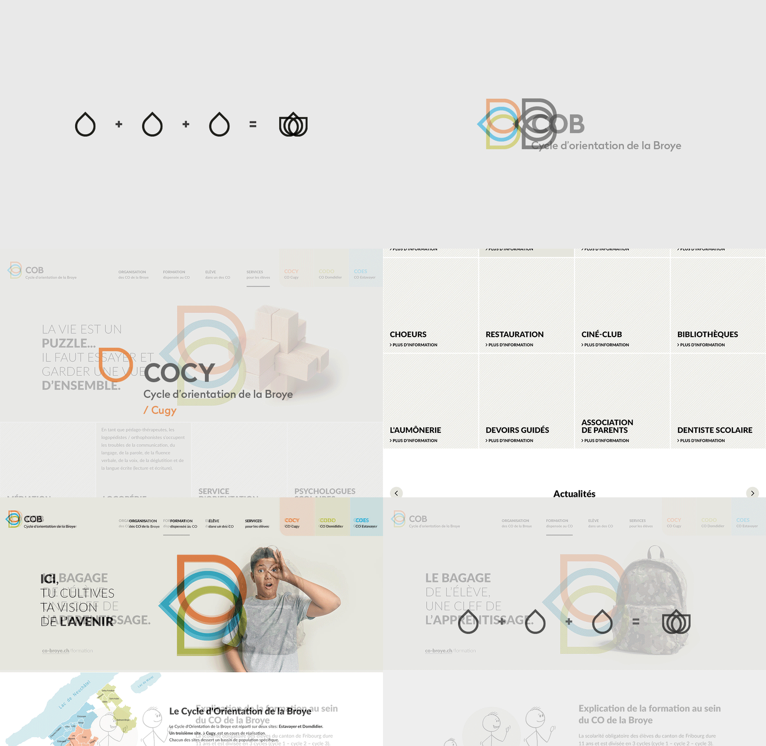
The logo is declined in the form of petals that represent each of the organizations meeting under the aegis of the COB. The full screen template uses a large Banner Hero which recalls the visual identity through the gesture of the child. This sign should be used in the future to create a brand image. Quotes on education support the image. The content of the information pages are stick figures reminiscent of children’s drawings.
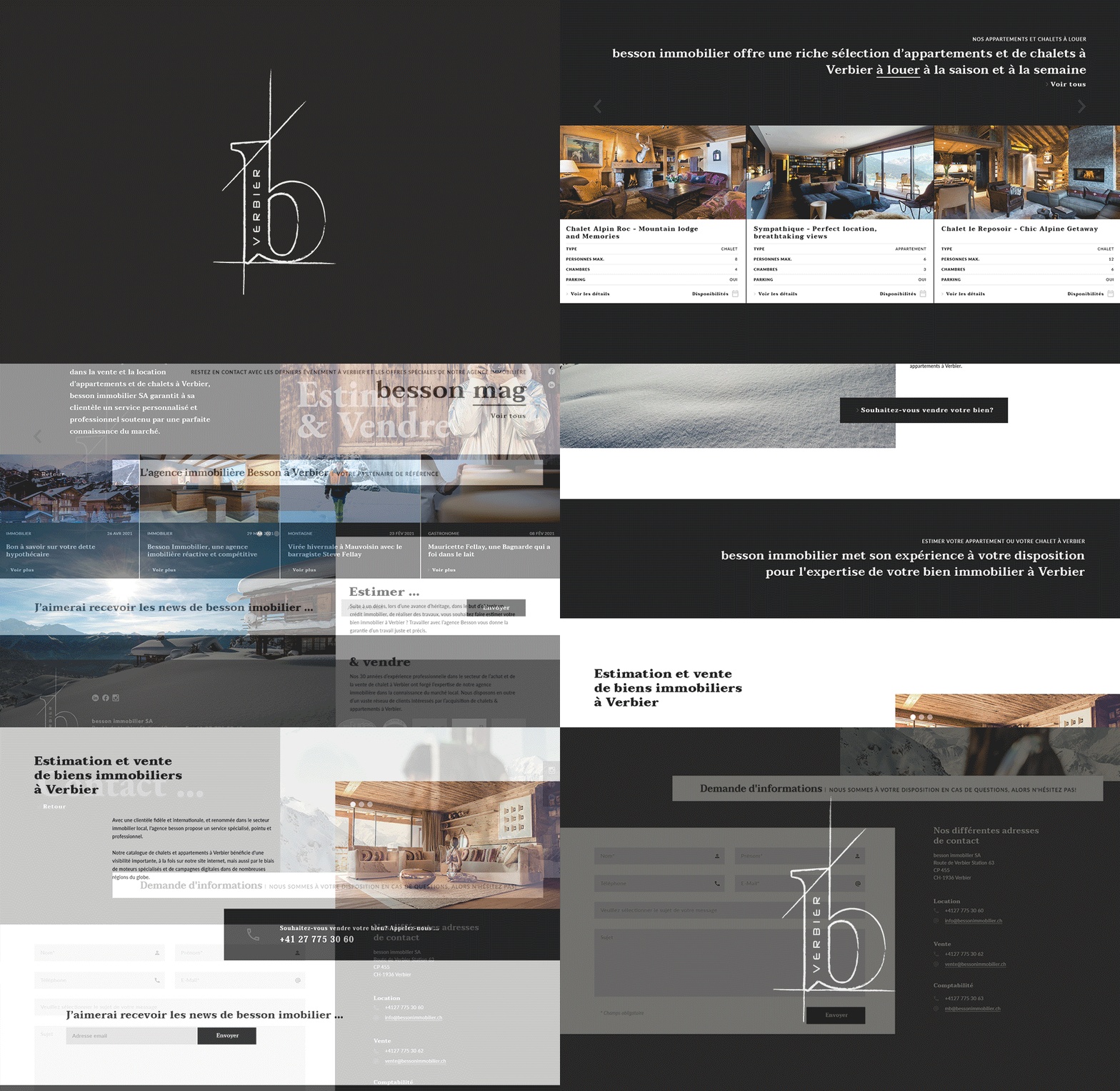
The characteristic construction lines of the Besson Immobilier visual identity caught my attention and I decided to draw inspiration from them for the elaboration of the graphic design. Therefore, I worked on a grid composed of lines based on the golden canon of the layout of Tschichold, that is to say the Golden Canon Grid which offered the advantage to realize a layout playing punctually with the imbalance.
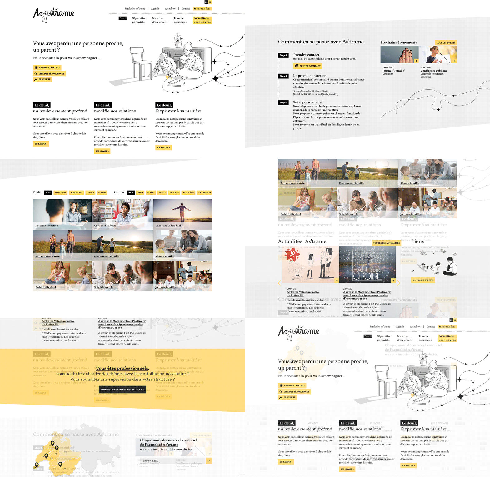
The visual is based on the illustrative style already present in the visual identity and linked by a “line punctuated with stars” motif representing the significant narrative of As’trame.
The minimalist color palette harmoniously accompanies the “black and white” illustrations, leaving the use of the yellow color for the highlighting of text or “Call to action”.
The result is a coherent web design that is skillfully linked to the client’s visual identity.
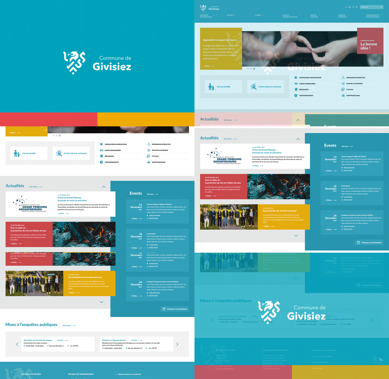
After a long research on heraldic symbolism and the history of the Municipality, I made evolve their coat of arms and stylized it. The result is a dynamic and modern badge that does not break the link with tradition. For the Web Design, I integrated the baseline to the banner to highlight their services. I played with overlays and offsets to give movement to the pages, thus obtaining a bold template for a municipal administration.
